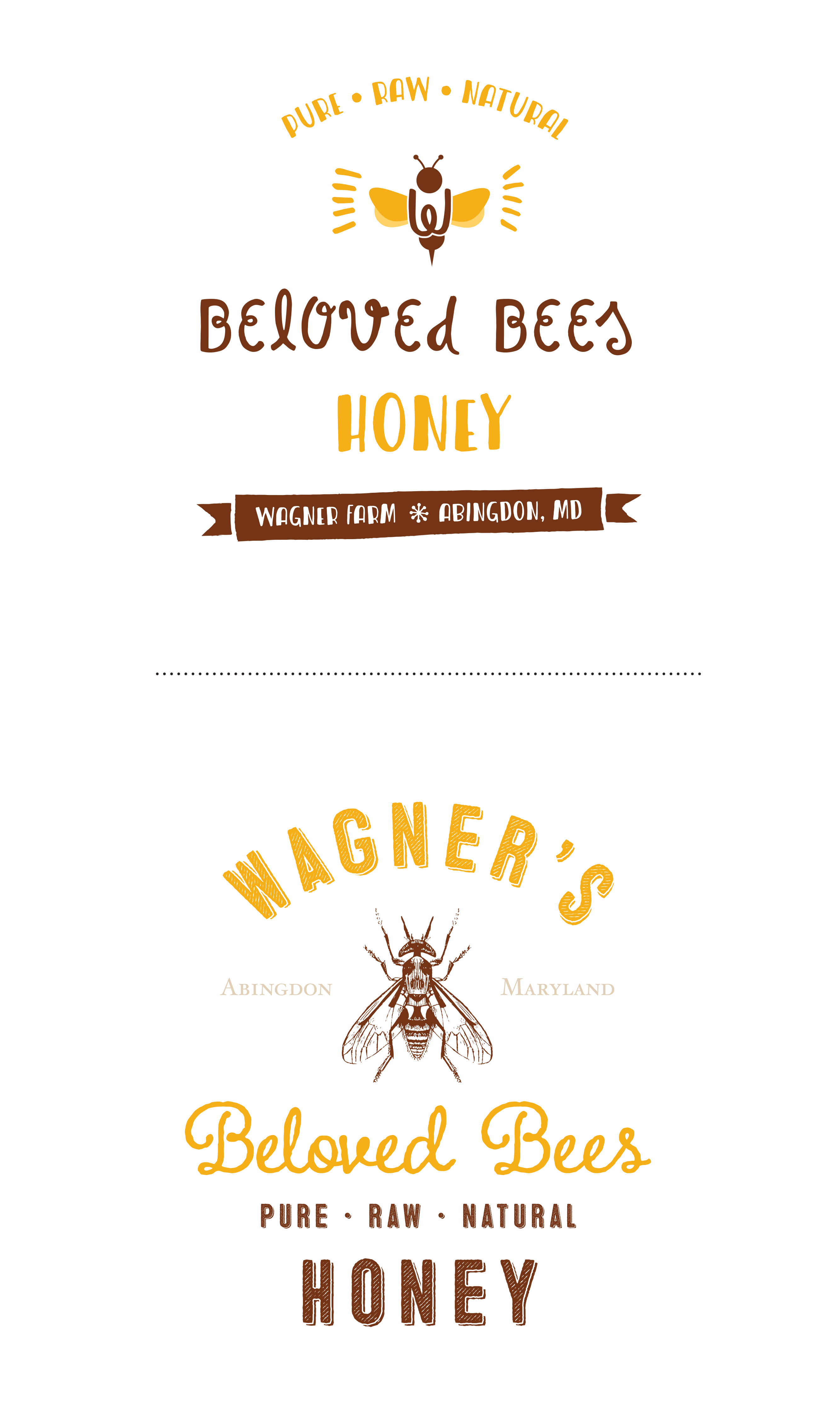
This week I’ve been working on a new branding project for a local farm here in Maryland. The Wagner family has recently expanded into the honey industry, purchasing bees for their newly acquired hives and tasking me with creating a strong identity to portray the family’s newest endeavor. After a multitude of brainstorming lists and sketches, I settled on several different concepts that made the cut to development (sayonara, bad ideas). Then, feeling as though all creative options had been exhausted, I sat back and examined draft 1, realizing that it has resulted in two extremely different paths.  The top concept is obviously focused more on a whimsical, natural feeling with it’s curly script and hand-drawn elements. It says, “The Wagners are a fun, lighthearted group of folks that want to share with you the sweet, sweet taste of honey.” The “W” in the body of the bee visually emphasizes that this honey is from the Wagner Farm and no other. The bottom concept has a more vintage approach. Drawing inspiration from old medicine bottles and elixirs I wanted this option to imply “Wagner’s Honey: your cure for the average blandness!” In order to support this hefty statement, the typography needed to be sturdy and professional, yet with a hint of charisma to accentuate the word “beloved.” I hand-drew the bee, basing it on antique anatomical illustrations, to create a custom icon for the mark. Many times, we know what the client wants before they do. The most important step of the branding process is getting inside of their head and pulling the things that not only seem appropriate, but also those that have yet to stand out—the ones that are sitting in that dark corner with cobwebs all over themselves. In this case, I’ve gathered enough information to create two very different marks that will most likely have two very different reactions from the viewer. It never ceases to amaze me how much of an influence these visuals have on their audience. I look at things in my everyday—from posters to soup cans—and evaluate their graphic quality…
  …but knowing that not everyone spends their days staring at letterforms and color palettes, it’s our job as designers to ensure that Average Joe doesn’t find himself staring at his can of chicken noodle and wondering why it just doesn’t “look right.” Finding the perfect balance between image, type, color, hierarchy, etc. is a daunting task every time we begin something new. But at some point we find that sweet spot where everything is perfectly, creatively zen (at least until the client gets their paws on it)—which is almost as satisfying as that nice glass of Petite Sirah waiting for you after a hard day’s work. Go on, you deserve it. Stay posted for next steps in the Wagner Honey branding extravaganza! Now about that wine… Cheers, J.
2 Comments
Comments are closed.


Love them both, obvi… but #2 is ahhh-mayyyzing.
I also love both of the designs, but I think #2 is the best!