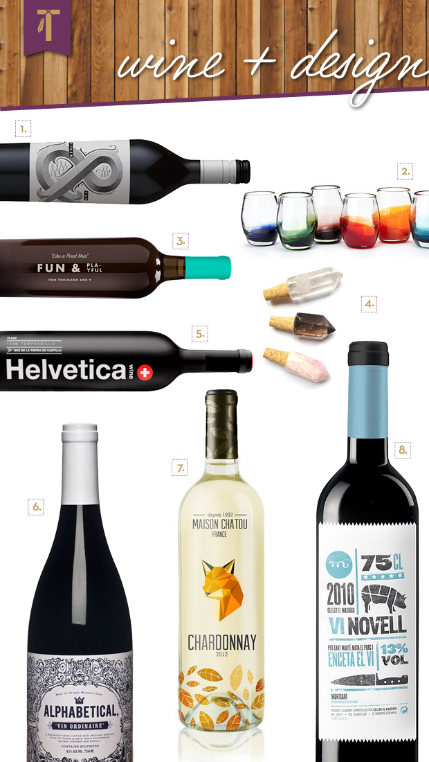
To get the ball rolling, a little creative grape juice…
1. Ampersand label design for Hither & Yon
2. Ombre stemless glasses from Uncommon Goods
3. Some simple typography and a pop of color goes a long way on this bottle from Vinkara
4. I’m in love with these quartz crystal stoppers; who says all bars have to be manly?
5. It’s called Helvetica—need I say more?
6. Alphabetical highlights the designer-y love of the letterform plus beautiful vintage illustration, all in one
7. That is one foxy Chardonnay…
8. An infographic on a wine bottle? Sold.
I know I’m not the only person whose wine selection is generally driven by the label. While wine and food are meant to pair well, I don’t think we should overlook the fact that—especially for the younger generation, which is up-and-coming in the wide world of vino—the design of a label also needs to pair well with its audience.
Take the average mid-20’s female (ohh, let’s say blonde hair, blue eyes, about 5’3″, enjoys typography and long walks on the beach…) and ask her to describe the tannins, the nose and the mouthfeel of the wine she just tasted; more often than not, you will receive nothing more than a blank stare. This particular audience is not usually perusing the aisles of your local wine shop looking for “a bold red with a smooth finish,” she’s looking for bright colors, quirky names and attractive imagery.
In case you haven’t gotten the hint, I’m far from a wine connoisseur. I drink it, I love it and I do occasionally dabble in the foreign language of Wine Speak, but most evenings I’m picking up a bottle in between “this and that” and don’t really have time to spend exploring the cellar notes on the back, half of which I probably won’t understand anyway.
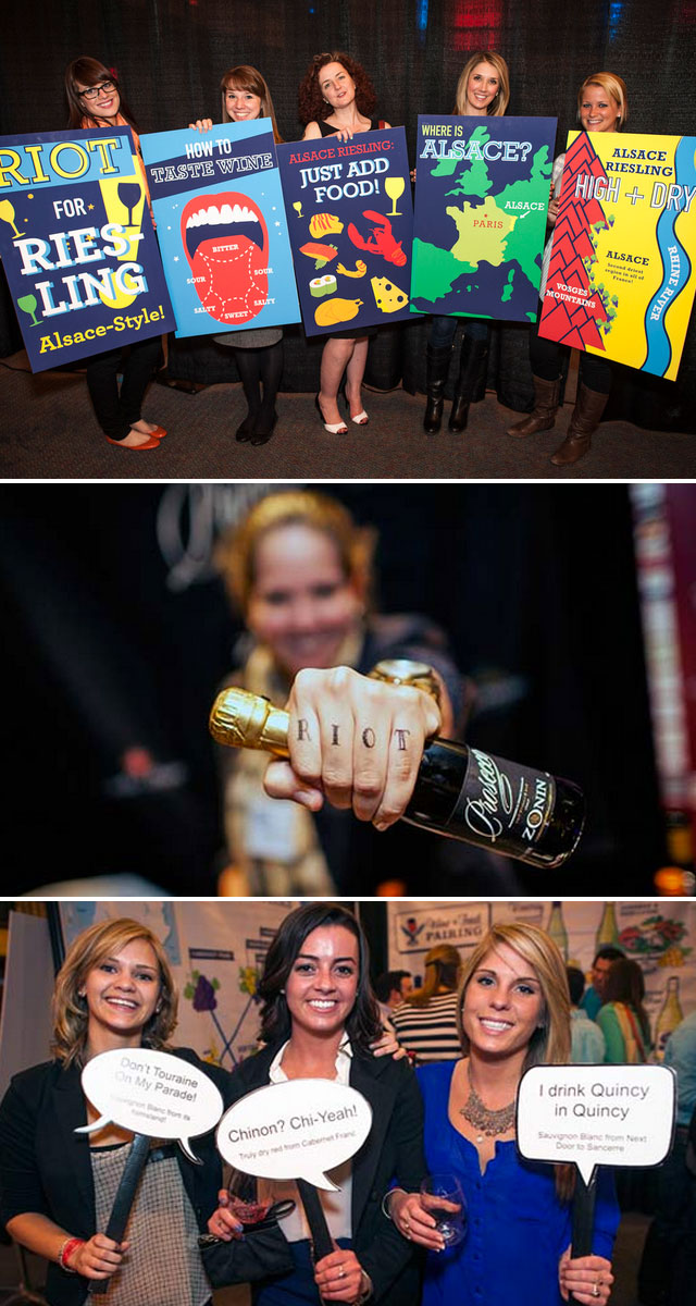
Second Glass, creators of the quickly growing event Wine Riot, have accepted the challenge of helping this younger generation become more involved in the science behind the vino we love so very much. I attended Wine Riot in 2012 and was pleased to see that they are successfully helping novices such as myself learn about the world of wine in a fun and non-intimidating way.
The bold design and display of information that can normally be rather “dry” (pun intended), combined with humorous things such as temporary tattoos and photo booths has brought it down to our level and created a world where wine is less intimidating and more interesting. Make sure you check out the schedule to see when Wine Riot will be closest to you!
Cheers,
J.


